In our first blog post, ‘Haringey website – time to move house‘, we talked about how and why we are building a new website for Haringey. In this post, I am going to talk about how we have changed the way we create web content, introducing a new way of working called user centred design. A key part of user centred design is content design.
The role of content design was introduced as part of a major change in the way that central government designed and maintained their websites, over 10 years ago. The Government Digital Service (GDS) was the first organisation to employ content designers. GDS are responsible for creating GOV.UK.
Content designers design content. They don’t write copy and they are not editors or content managers.
“Good content design allows people to do or find out what they need to from government simply and quickly using the most appropriate content format available. It is based on research into GOV.UK user behaviour, analytics and feedback.”
GOV.UK
By adopting this new user centred content design approach, we are designing web pages and digital experiences that are based on what the people of Haringey need.
User research on the current Haringey website
In 2022 we asked a user research company Telltale Research to undertake some analysis of haringey.gov.uk. They asked people living and working in Haringey what they thought of the site. The headlines from that research were that the site:
- was difficult to navigate
- was hard to understand, using confusing language
- was designed poorly and inconsistently
- had too many sections and pages
- performed poorly on a mobile device
- was largely inaccessible for people using screen readers
- had too many PDFs and documents
The research told us that it was clear that the content needed to be analysed and redesigned. Which is where I joined the story.
How we used content design to redesign the Haringey website
I am a content designer, and have worked with different local councils to help bring a content design focus to rebuilding council websites. When I joined this project, we first looked at what sections we could redesign from scratch, to show the power of a user centred design approach.
Developing an alpha site
The 3 stages of this project were to develop:
- an alpha site with 4 sections, for internal testing only
- a public beta site with 7 sections
- a live site with all the new content
The 4 sections to agreed to work on for our alpha site were:
- Council Tax
- benefits and financial support
- leisure, parks and culture
- births, deaths, marriages and citizenship
We then assigned a lead content designer to each section, and followed a 4-step process.
Step 1 – data, research analysis and auditing content
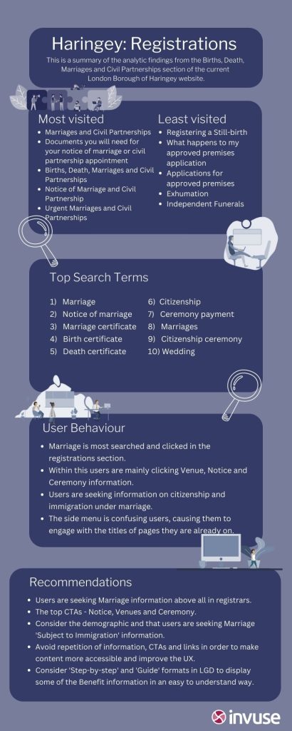
Having great user research makes the life of a content designer so much easier. Haringey worked with two user research companies, Telltale Research and Invuse, to gather lots of research about how people were using the current site.

I used this insight as a starting point to inform the work I did on both Council Tax and Births, death, marriages and citizenship. The research gave me knowledge of what users liked, did not like, found difficult to find and understand.
I also looked at Google Analytics, to find out data on how many people:
- viewed the pages
- dropped out of the site
- did not engage with the content at all
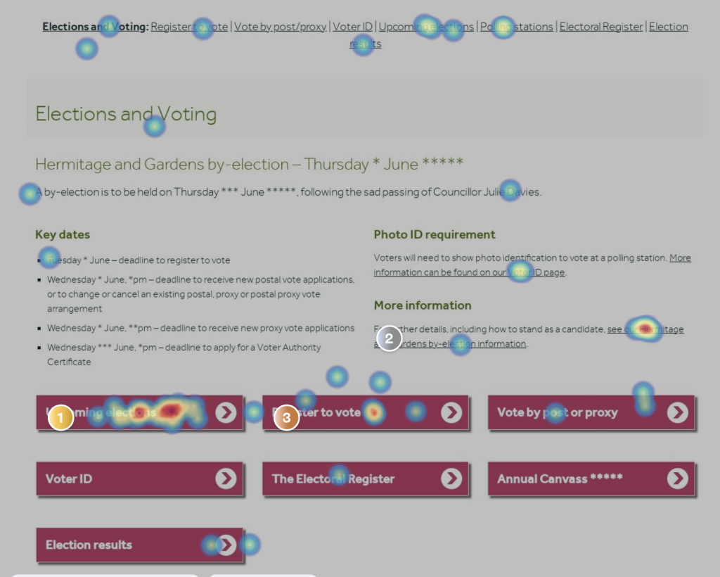
The final data tool I used was heatmaps, using Hotjar. Heatmaps are a way of presenting data graphically. Values are shown by colour, making it easy to visualise complex data and understand it at a glance. Hotjar allows me to see:
- anonymised recordings of people using a particular webpage and their user journey
- amalgamated heatmaps of how people use specific pages, showing hotspots of where people click and input information

This first stage gave me a good analytical base to move to step 2, understanding the user.
Step 2 – user stories and user journeys
The more you know about your users, the easier it is to design content based around their needs. Step 2 involved both mapping user journeys and writing user stories.
User journeys
By plotting out a user journey, I can start to see where someone enters the sites, and where they exit. It also allows me to see where they may come against a barrier. For example:
- they can’t find something in search
- a link is broken
- the language is unclear
- a PDF download does not work
- an online form does not work on a mobile phone
User stories
I also wrote out some key user stories. User stories allow me to think of the key tasks and helps focus the content on what people are trying to do. They are usually written in this format:
- as a new Haringey resident
- I want to find out who my local councillor is
- so I can contact them about an issue I am having
Step 3 – information architecture
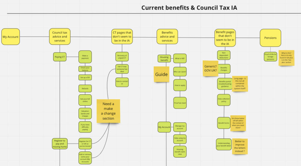
Step 3 involves creating a new structure for a section, known as the information architecture. This was particularly important because research found that people struggling to find information was one of the main issues on the site.
One of the first things we decided was to split Council Tax and benefits. They are now separate sections. One is something you pay, whereas the other is something you claim. They therefore work better as separate, smaller sections.
We also decided to add citizenship into the section title of births, deaths and marriages, as data showed us lots of people looked for it. We also created fewer second level headings. This will help people choose where to click, as we are not overwhelming them with too many choices.

Step 4 – content types
Step 4 was to map content types against every single page. We are a member of LocalGov Drupal (LGD), collaborating with over 35 other councils. The LGD content management system has a number of content types we can use. These include:
- service pages (single pages about a single topic)
- guides (a group of pages on a wider topic)
- step by steps (a group of pages directing someone through an end to end process)
- directories (information grouped into a directory, with searchable facets)
- subsites (a group of pages allowing you to add separate branding, images and videos, with its own section navigation)
- news
- events
These content types have been developed off the back of extensive GDS research, and allow content to be created consistently across the site. The content types also work well across both desktop and mobile browsers.
Alpha testing
The next step was to design the new content. I worked out what content to move and what to leave behind. I wanted to reduce both the volume of content and the number of pages.
Working with the relevant departments, I designed 2 new sections:
- Council Tax
- births, death, marriages and citizenship
These were tested internally with staff, along with:
- leisure, parks and culture
- benefits and financial support
Content design principles
We also developed a set of new content design principles, stating that content will:
- reflect user needs
- have a user-focused, simple, mobile-first content structure
- be written in plain language
- use the most appropriate content format
- be accessible (for people with disabilities)
- not contain information that is owned and managed by others
- be regularly reviewed
Beta testing
Once we gathered alpha feedback, we acted on key findings and moved into our beta phase. This involved designing 3 more sections:
- council and elections
- rubbish and recycling
- environment
We followed the same content design process as we did in alpha. We have recently put our 4 alpha sections live to the public, as well as:
Redirecting all site traffic through these new sections will provide invaluable quantative data, and we will iterate the site based on any key feedback.
A new way to manage content
We have also implemented a new way to manage all of the content on our new website. By always starting with user needs, data and research, we hope to keep the site user focused.
We want to make sure the information continues to be easy to read and find. Our new beta site is live and we welcome any feedback you may have.
